The web design trends worth acting on in 2026 are the ones you can point to in a browser release, a design system or the law, not on a mood board. Accessibility has become a legal baseline since the European Accessibility Act came into effect on 28 June 2025. Browsers now handle animation, page transitions, tooltips and styled dropdowns natively. Google and Apple have both launched bolder, more expressive design languages. And speed is now part of the design brief, not an afterthought.
This guide covers the latest web design trends that are backed by real changes, what each one means for a business website, and which ones are worth doing now. Every claim links to its source, so you can check it yourself before you brief a designer.
Why most web design trends lists get it wrong
Search for web design trends and you’ll find lists of styles, such as neon gradients, 3D blobs, brutalism or giant typography. Some of those are fun, but a style isn’t a trend your business needs to follow. Visual fashions change every year and rarely move enquiries.
The design trends that matter are the ones that change what’s possible, what’s expected or what’s required. A browser feature that lets your designer build something without a heavy plugin. A law that makes accessibility a requirement for selling to EU customers. A design system from Google that’s been tested on thousands of people. Those shape every website for years, so they’re the ones in this guide.
1. Accessibility becomes the standard, not an extra
The biggest change in web design isn’t visual. It’s that accessible design is now expected by law, by customers and by search engines.
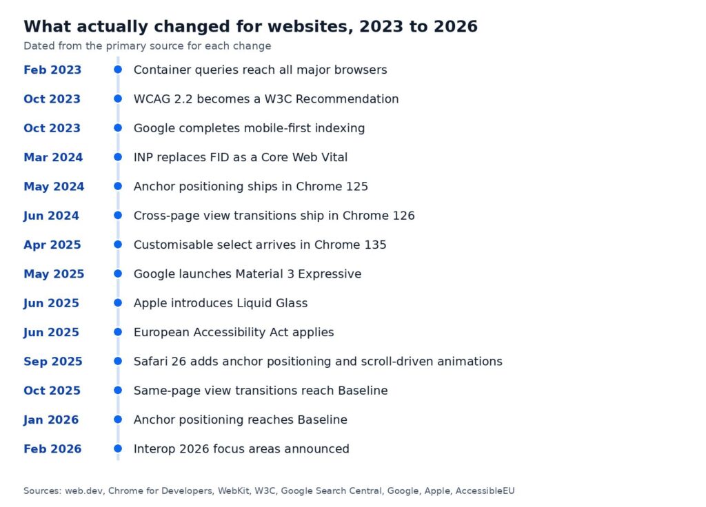
- WCAG 2.2 became a W3C Recommendation on 5 October 2023. It adds new success criteria such as minimum target sizes for buttons and links.
- The European Accessibility Act covers products and services sold in the EU, including e-commerce, banking, e-books and passenger transport. It applies from 28 June 2025. If you sell online to EU customers, check whether it covers you.
- In the UK, public sector websites must meet WCAG 2.2 AA and publish an accessibility statement.
Most of the web still falls short. The WebAIM Million 2026 report found detectable WCAG failures on 95.9% of the top one million home pages, up from 94.8% in 2025. Low contrast text was the most common problem, on 83.9% of home pages.
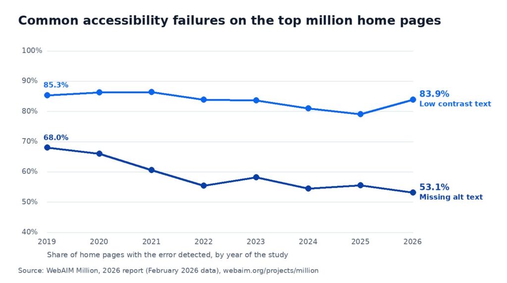
For your site this means real colour contrast, visible focus states, labelled form fields, alt text on images, buttons big enough to tap and a layout that works when someone zooms in. WCAG 2.2 asks for a contrast ratio of at least 4.5 to 1 for normal text and 3 to 1 for large text. Pale grey text on white, a popular look for years, often fails.
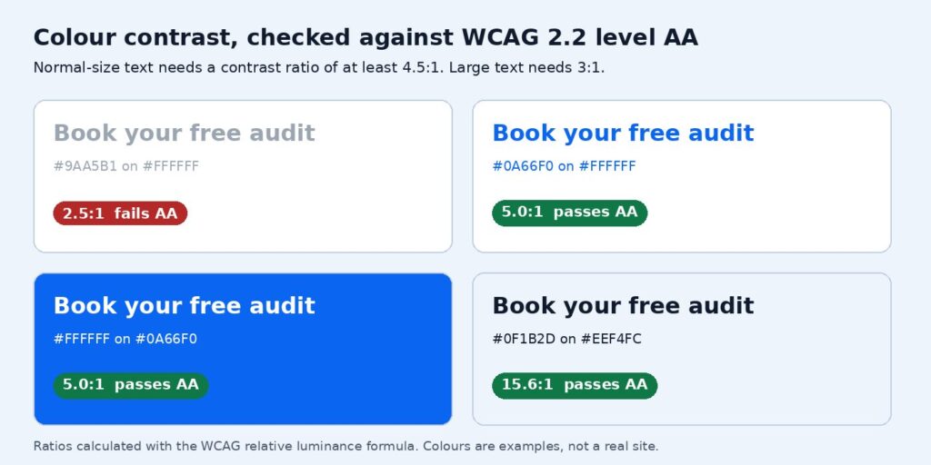
Worth doing now? Yes, for every website. It’s the one trend that’s also a legal question, and fixing contrast, labels and alt text is usually quick.
2. Motion, animation and page transitions built into the browser
Smooth animation used to mean JavaScript libraries, which added weight and often broke on slow phones. That’s changing fast, because the browsers now do the work.
View transitions
View transitions animate the change from one view or page to the next, such as a product photo growing into the product page. Chrome 126 enabled cross-document view transitions between pages on the same site, so ordinary multi-page websites can use them, not just apps. Same-page view transitions became Baseline Newly available on 14 October 2025 when Firefox 144 shipped, meaning they work in all three major browser engines.
Scroll-driven animation and parallax scrolling
Scroll-driven animations tie an animation to how far someone has scrolled, which is how parallax scrolling effects, progress bars and reveal-on-scroll sections are now built in plain CSS. Safari 26 added scroll-driven animations in September 2025, and MDN lists animation-timeline as Baseline since October 2026.
The catch is that motion has to be optional. Some people get dizzy or distracted by movement, and their device can tell your site so. The prefers-reduced-motion media feature lets a site turn animation down for those visitors, and WCAG 2.2 requires a way to pause anything that moves on its own for more than five seconds.
Worth doing now? Yes, in small doses. Subtle, purposeful motion makes a site feel modern and helps users follow what changed. Motion for its own sake still slows pages and distracts from the message.
3. Native interface elements replace plugins
A lot of the interactive elements on a typical site, such as tooltips, menus, popups and styled dropdowns, have relied on plugins and scripts. Browsers now ship many of them as standard HTML and CSS.
- Popovers. The HTML popover attribute creates menus, tooltips and panels that open on top of the page. MDN shows it working across browsers since April 2024.
- Anchor positioning. Places one element next to another, such as a tooltip beside its button, without JavaScript. It shipped in Chrome 125, arrived in Safari 26, and became Baseline Newly available with Firefox 147 in January 2026.
- Customisable select. Dropdown menus have always been hard to style. From Chrome 135, a standard select element can be fully styled with CSS, including icons in each option. Other browsers are still catching up, so it needs a plain fallback.
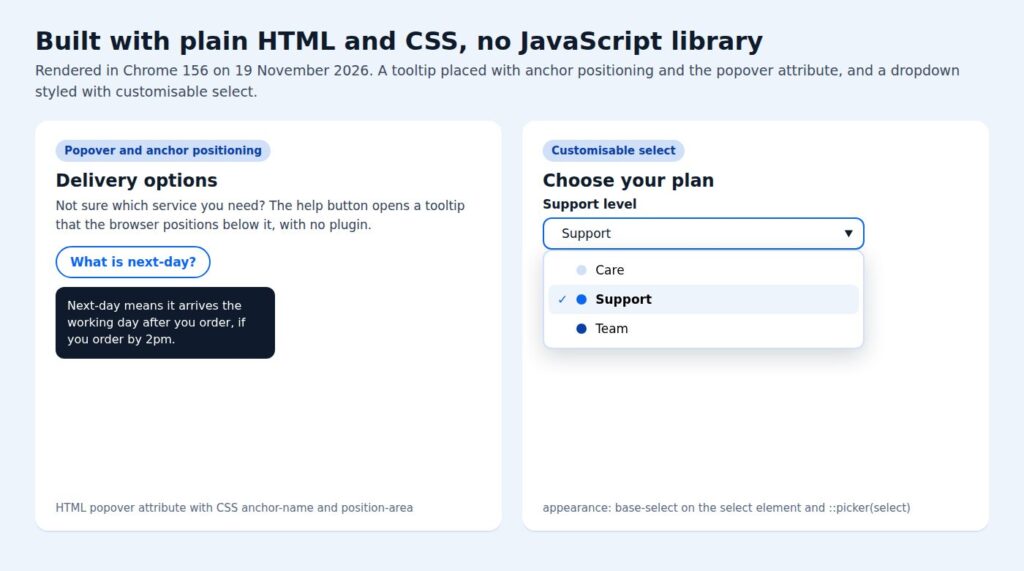
For a business site, this is about speed and reliability more than looks, and it makes interactive elements easier for every user. Every plugin you don’t need is less code to load and one less thing to break after an update. It’s also good news for accessibility, because native elements handle keyboard use and screen readers properly by default.
Worth doing now? Yes, when you’re building or rebuilding components. Don’t rip out working plugins just to follow the trend, but new interactive elements should use the native versions where browser support allows.
4. Component-led layouts and grid layouts
Responsive web design used to mean designing a few page widths, phone, tablet and desktop. Modern layout is built from components that adapt to the space they’re given, wherever they appear.
The tool behind that is container queries. They let a card, form or product tile change its layout based on its own container, not the whole screen. Container queries landed in all stable browsers in February 2023, and container style queries are one of the Interop 2026 focus areas. Combined with CSS grid, they make layouts that hold up on any device without endless special cases.
In practice, this is what lets your marketing team drop the same testimonial or event card into a full-width section or a narrow sidebar and have it look right in both. Our guide to responsive web design explains the basics.
Worth doing now? Yes, for new builds and redesigns. It’s mostly invisible to visitors, but it makes the site far easier to extend.
5. Bolder visual design, typography and expressive design systems
After years of flat, minimal interfaces, Google and Apple have both moved their design systems towards more personality.
- Material 3 Expressive. Google launched Material 3 Expressive in May 2025. Its design guidance is built on colour, shape, size, motion and containment, and Google says it was shaped by 46 research studies with more than 18,000 participants, and that people spotted key interface elements up to four times faster in the expressive designs.
- Liquid Glass. Apple introduced Liquid Glass on 9 June 2025, a translucent material across its platforms that reflects and refracts what’s behind it.
The useful lesson for websites isn’t to copy either look. It’s what Google’s research points to. A larger, more prominent main button gets noticed faster, and clear visual hierarchy beats a page where everything is the same size and weight. Bold typography, generous spacing and one standout action per screen are the design principles that translate to a business site and improve the user experience.
Glass and translucent effects need care. Text over a blurred background can easily drop below the contrast ratio WCAG asks for, so test it with real content before using it on anything people need to read.
Worth doing now? The principles, yes. The specific aesthetic, only if it suits your brand.
6. Dark mode and respecting user settings
Phones and computers let people choose light or dark mode, bigger text and less motion, and websites are increasingly expected to respect those choices. The CSS light-dark() function has been Baseline since May 2024, which makes a dark mode version of a site much simpler to build and maintain.
Worth doing now? Optional for most business sites. It’s worth it for content people read for a long time, such as documentation, dashboards and long articles. Make sure logos and images still work on a dark background if you add it.
7. Speed is part of the design
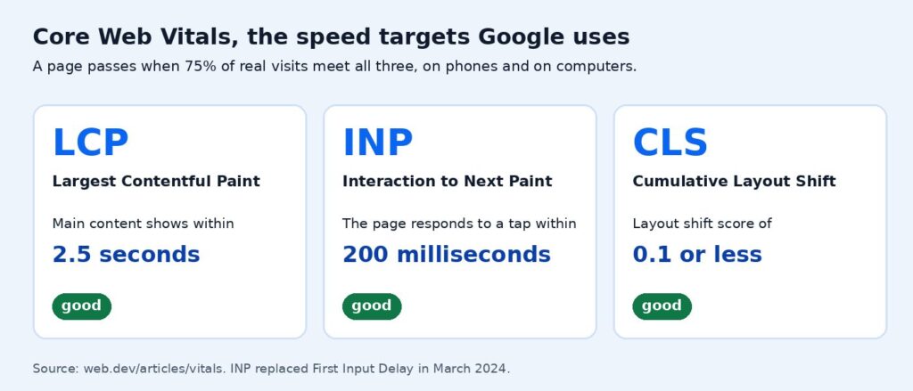
A beautiful layout that takes five seconds to appear on a phone isn’t a good design. Google’s Core Web Vitals measure what visitors actually experience. The main content should load within 2.5 seconds, the page should respond to a tap within 200 milliseconds, and the layout shift score should stay at 0.1 or less, for at least 75% of visits. Interaction to Next Paint replaced First Input Delay as the responsiveness measure on 12 March 2024.
Design decisions drive most of these numbers. Huge hero videos, unoptimised images, several web fonts and heavy animation libraries all slow pages down. The native features above help, because they replace scripts with built-in browser code. Our guide to Core Web Vitals and page experience goes into the detail.
Worth doing now? Always. Speed affects every visitor and every campaign you run.
8. Mobile is now the majority, so design for the phone first
This isn’t new, but the numbers have tipped. StatCounter’s October 2026 data puts mobile at 51.95% of UK web page views, against 43.66% for desktop. Google also completed mobile-first indexing in October 2023, so the mobile version of each page is the one it ranks.
Designing for the phone first means one clear action per screen, buttons in easy thumb reach, short forms and no popups that cover the whole screen. Desktop still matters at over 40% of page views, but it shouldn’t be the only screen your designer reviews.
9. Designing for AI answers as well as search results
More people now get answers from AI Overviews, AI Mode and chat assistants before they visit a site. Google’s guidance for AI features says there are no extra requirements or special optimisations to appear in AI Overviews or AI Mode, and that normal SEO best practice still applies.
That makes good content design more valuable, not less. Clear headings that match real questions, a direct answer at the top of each page, real text rather than text in images, and facts with sources are easier for people and for AI systems to understand and quote. If being cited in AI answers matters to your business, our AI search optimisation service focuses on exactly that.
10. What browsers are working on next
Each year the major browser makers agree a list of features to make work the same everywhere. Interop 2026, announced on 12 February 2026, includes anchor positioning, container style queries, dialogs and popovers, scroll-driven animations and cross-document view transitions. That’s a good sign these are the techniques web designers will rely on over the next few years.
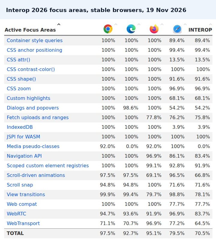
The live Interop 2026 dashboard shows how close each browser is. Where scores are still uneven, as with view transitions, use the feature as an enhancement that adds polish where it works and does no harm where it doesn’t.
Immersive and minimalism trends to treat with care
Some popular ideas cost more than they return on a business website.
- Autoplay video backgrounds. They’re heavy on mobile data, slow the main content and must have a pause control under WCAG if they run for more than five seconds.
- Rotating sliders. Nielsen Norman Group notes that people often scroll past carousels, and a single static hero message usually works better.
- Immersive 3D and heavy scroll effects. Impressive on a fast laptop, but they can stutter on slower phones. Keep them for campaigns where the experience is the point, and always check the reduced-motion version.
- Low-contrast minimalism. Thin grey text on white looks elegant in a mock-up and fails contrast checks on a real screen.
- Full-screen popups. Google warns that intrusive interstitials frustrate users and can make your content harder for search engines to understand.
How to use these web design trends on your website
| Trend | What it changes | Do it now? | Best for |
|---|---|---|---|
| Accessibility to WCAG 2.2 AA | Contrast, labels, alt text, tap targets, zoom | Yes | Every site, especially anyone selling to EU customers |
| Native animation and view transitions | Smoother page changes without heavy scripts | Yes, subtly | Shops, portfolios, event sites |
| Native popovers, tooltips and selects | Fewer plugins, better keyboard and screen reader support | When building new components | Sites with forms, filters or product options |
| Container queries and grid | Components that fit anywhere | On new builds and redesigns | Sites your team edits often |
| Expressive design | Bolder hierarchy, bigger main buttons | The principles, yes | Brands that want more personality |
| Dark mode | Respects the visitor’s setting | Optional | Long-read content and web apps |
| Speed and Core Web Vitals | How fast every page feels | Always | Every site |
| Content for AI answers | How clearly pages answer questions | Yes | Anyone who gets enquiries from search |
You don’t need a full rebuild to benefit. Accessibility fixes, faster images, a clearer main button and better page structure can all be done on an existing site. If the site is old enough that every change is a fight, a website redesign is often quicker than patching. Our guide to reasons to invest in a redesign helps you decide.
Common questions about web design trends
Which design is trending now?
The clearest trends are accessible design, purposeful motion built with native browser features, bolder visual hierarchy inspired by systems like Material 3 Expressive, component-based layouts and fast, mobile-first pages. Visual styles vary, but those changes are showing up across the web.
What is a good web design?
A good web design makes it obvious who you help and what to do next, works on every screen, loads quickly and can be used by everyone, including people using a keyboard or screen reader. Trends only matter if they make those things better.
What should I look for in a web designer?
Look for recent work on sites like yours, a clear view on accessibility and speed, and a plan for who looks after the site once it’s live. Our list of questions to ask before hiring a web designer covers the rest.
How often should a website follow new design trends?
Treat trends as a reason to review, not to rebuild. Accessibility and speed improvements are worth doing as soon as you can. Visual refreshes usually make sense every few years, or when the site no longer reflects your business.
Final thoughts on web design trends
The latest web design trends are less about a new look and more about doing the basics properly with better tools. Accessible, fast, mobile-first sites with clear hierarchy and a little purposeful motion will age well, whatever the visual fashion is next year. If you’d like to know where your current site stands, our free website audit checks speed, SEO, security and tracking, and our web design team can help you put the useful trends to work.