Website elements are the building blocks inside each section of a web page, such as buttons, forms, images, accordions, tabs, tables and testimonials. Every website uses a mix of them, and the right mix decides whether visitors find what they need and take the next step. The test for each one is simple. Does it help a visitor understand, trust or act? For form fields, for example, WCAG 2.2 asks for a label or instruction on every input, so people know what to type.
This guide covers the web design elements that matter most for business sites, what each is for and when to use it, with real examples. If you want the larger structure of a page, the header, navigation, hero section, sidebar and footer, read our guide to the parts of a website first. That covers the sections. This one covers the elements that go inside them.
What are website elements?
Website elements, also called web page elements, website components or UI components, are the reusable pieces a page is built from. Designers and developers use the same names, so knowing them makes briefs and feedback faster. They fall into a few groups.
- Action elements that get people to do something, such as buttons and forms
- Content elements that organise text, such as cards, lists, accordions, tabs and tables
- Trust elements that prove you’re credible, such as testimonials, reviews, logos and team profiles
- Visual elements such as photos, galleries, icons, video, charts and maps
- Overlay elements that appear on top of the page, such as popups, lightboxes and tooltips
Most good websites use fewer elements than you’d expect, used consistently. That’s the core idea behind every design system, and it keeps the experience consistent for your audience. A small set of buttons, cards and forms, styled the same everywhere, so the site feels familiar from the first page to the last.
Call-to-action buttons that drive action
Buttons are the most important elements on most pages, because they’re how visitors act. A call to action (CTA) button should say what happens when you press it, such as “Get my free audit” or “Book a stand”, rather than “Submit” or “Click here”.
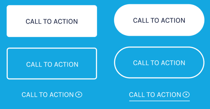
Use one main button style for the primary action and a quieter style, such as an outline or text link, for secondary actions. The main button is the conversion point of the page, so give it space and contrast.
Touch targets on every device
Make buttons big enough to tap on a phone. WCAG 2.2 sets a minimum target size of 24 by 24 CSS pixels, with exceptions where targets are spaced apart, and bigger is kinder on a phone.
Forms that convert visitors into enquiries
Forms collect enquiries, bookings, registrations and orders. They’re also where many sites lose people, so every field has to earn its place. In checkout research, Baymard Institute found the average checkout had 11.3 form fields in 2024, while most sites need only 8.
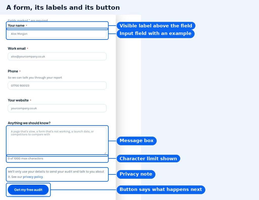
A form that works well has these features.
- A visible label above each field, not just placeholder text that disappears when you type
- Only the fields you genuinely need, marked clearly if they’re required
- Clear error messages that say how to fix the problem
- A short privacy note near the button
- A button that says what happens next
Behind the form, make sure each enquiry actually reaches the right inbox or CRM, and that you can measure it. Broken form notifications are easy to miss, because they’re invisible until someone asks why enquiries have dried up. Checking them is part of good website support.
Content elements for building clear pages
Cards, content boxes and lists
Content elements decide how easy a page is to read. Cards group a heading, short text, an image or icon and a link into one block. They’re ideal for services, articles, products and features, because they line up in a grid on a computer and stack neatly on a phone. Lists, bulleted or numbered, break up text so people can scan it. Use numbered lists for steps and bullets for everything else.
Accordions
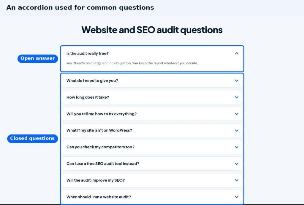
An accordion is a stack of headings that open to reveal content when clicked. It suits common questions, detailed specifications and anything people only need now and then. Nielsen Norman Group advises using accordions on desktop for content-heavy pages where users won’t need to open several sections, because hiding content adds effort.
Tabs
Tabs split related content into panels on the same page, such as a product’s description, specifications and delivery details. They work when people only need one panel at a time. If visitors are likely to compare panels side by side, show the content openly instead.

Tables
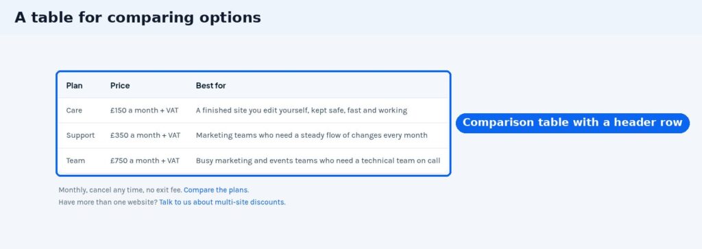
Tables compare options at a glance, such as plans, prices, sizes or features. Give them a header row, keep each cell short, and check they scroll or stack properly on a phone.
Process steps and timelines
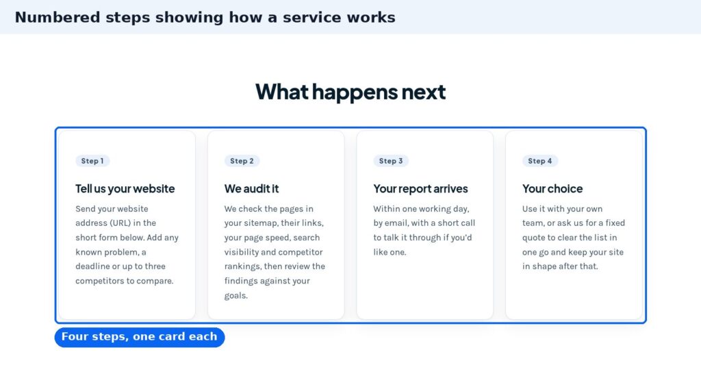
Numbered steps show how something works, from first contact to delivery. They answer “what happens next?”, which is one of the biggest reasons people hesitate before getting in touch.
Trust elements, testimonials and customer feedback
These elements show a new visitor that other people have used you and been glad they did. The strongest is a real testimonial or review with a name, company or source, ideally linked to the review site. Client logos, case studies, accreditations and team profiles help too, and counters such as years trading or projects completed work when the numbers are real.
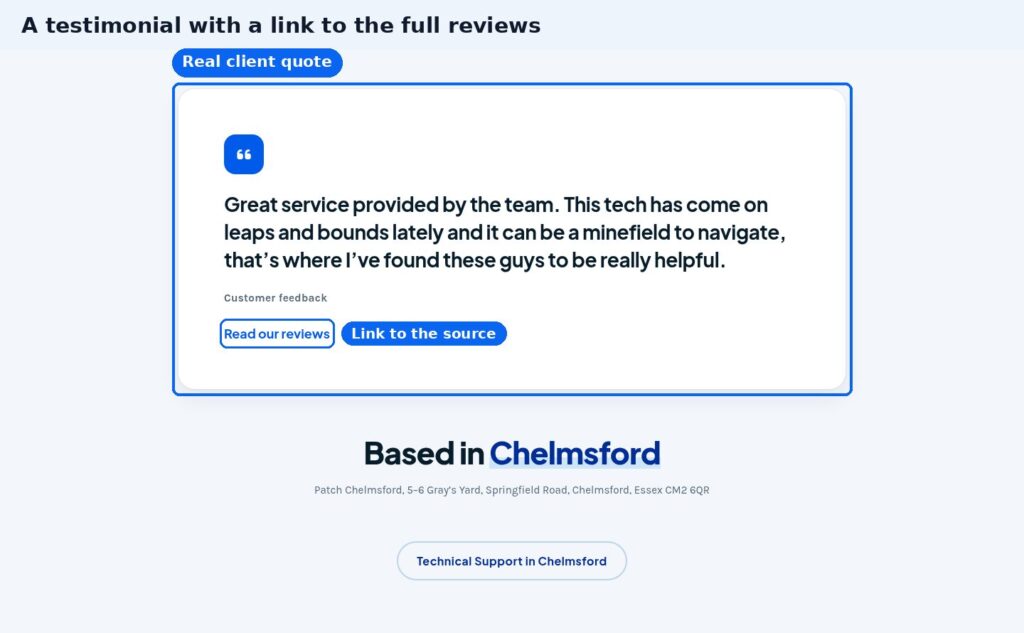
Put these elements next to the decision they support. A review beside the enquiry form does more than a page of testimonials nobody visits. Never write your own reviews or edit real ones to sound better. Customers spot it, and it undermines the real ones.
Visual elements, images, video and typography
Images, video, icons and typography do most of the work of making a brand feel like itself online. Use real photos of your team, work, venue or products wherever you can. Stock photos fill space, but they rarely build trust.
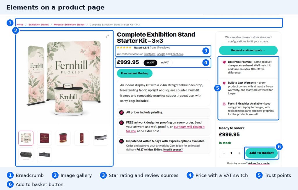
The product page above shows several elements working together. A breadcrumb shows where you are, the image gallery shows the product from every angle, the rating and trust points answer doubts, and one clear button lets you buy.
- Image galleries and lightboxes. A gallery shows several images in a grid or carousel. A lightbox opens one larger over the page. Both suit products, venues, events and portfolios.
- Video. Embedded video from YouTube or Vimeo is fine for demos and event highlights. Avoid autoplaying background video that distracts from the message and slows the page.
- Icons. Simple icons help people scan features and services. Use one style throughout.
- Charts. A simple bar chart explains a figure faster than a paragraph. Always say where the data came from.
- Maps. An embedded map helps visitors find your venue or office. Put the address in text too, for people and for search engines.
- Typography and colour. Two fonts at most, a clear size for body text, and enough contrast to read. WCAG 2.2 asks for a contrast ratio of at least 4.5 to 1 for normal text.
Image speed and performance on every device
Visual elements are also where most speed problems start. Large images slow pages down, and images or embeds without set dimensions make the page jump as it loads. Google’s web.dev guidance says to always include width and height on images and video so the browser can reserve the space. Our guide on why image size matters covers the rest, and a responsive layout should resize every image for the screen it’s on.
Website elements, SEO and your online presence
The elements you choose also affect how search engines read the page. A few habits make a real difference to your SEO.
- Alt text on images. Google calls alt text the most important attribute for describing an image. It also helps people using screen readers.
- Real text, not text in images. Headings and key messages written as text can be read, translated and indexed. Text baked into a banner image can’t.
- Answers in plain view. Accordions are fine for questions, but the critical information a customer needs to decide should be visible without clicking.
- Fast, stable pages. Heavy sliders, autoplay video and third-party embeds slow pages down, and speed matters for search and for people.
Landing pages for campaigns and events are a good place to apply all of this, because each one has a single job. Our landing page design service builds them from a proven set of elements.
Overlay elements, popups, sliders and countdowns
Some elements interrupt the page. Used well, they’re helpful. Used badly, they drive people away.
- Popups and slide-ins. Keep them for something genuinely useful, such as an event reminder, and never block the content as soon as the page opens. Google says intrusive interstitials and dialogs can frustrate users, erode trust and make it harder for search engines to understand your content.
- Sliders and carousels. They let several messages share one space, but Nielsen Norman Group notes that people often scroll past them. A single, clear hero message usually works better. If a slider moves on its own for more than five seconds, WCAG 2.2 requires a way to pause or stop it.
- Countdowns. Useful for events teams, such as early-bird ticket deadlines or show dates. Only use a real deadline, and remove the timer when it passes.
- Tooltips. Small hints that appear on hover or tap. Keep them short and never hide essential information in them, because touchscreens have no hover.
How to choose web design elements with a purpose
Start from what each page is for, then pick the elements that serve it. Here’s a simple guide.
| If the page needs to | Use these elements | Best for |
|---|---|---|
| Get an enquiry or booking | One clear button, a short form, a review beside it | Service pages, contact pages, landing pages |
| Sell a product | Image gallery, price, rating, trust points, add to basket button | Product pages in online shops |
| Answer detailed questions | Accordion, tabs, a comparison table | Pricing, specifications and FAQ sections |
| Explain a process | Numbered steps or a timeline | Services, onboarding and event registration |
| Build trust with new visitors | Testimonials, client logos, case studies, team profiles | Home pages and about pages |
Website elements for a small business
For a small business site, a handful of elements done well beats a page full of features. Every element you add is something to load, maintain and keep working on mobile devices. On a site that feels cluttered, the fix is usually removing elements, not adding new ones.
If you’re planning new pages or a rebuild, our web design and development team builds sites from a small, consistent set of components your marketing team can reuse without breaking the layout. That makes every digital campaign quicker to launch. We can also add or fix individual elements, such as forms, booking tools and galleries, as part of a website maintenance plan.
Common questions about website elements
What are the components of a website called?
The large areas are called sections, such as the header, hero, content sections and footer. The smaller pieces inside them are called elements or components, such as buttons, forms, cards, accordions, tabs and testimonials.
What are the essential elements of a good website?
Clear navigation, a strong headline, a visible call-to-action button, a simple contact form, real testimonials and fast, well-sized images. Everything else should be added because a page needs it, not because it’s available.
How can I see the elements on a website?
In Chrome, right-click any part of a page and choose Inspect. Chrome DevTools opens the Elements panel with that element selected, so you can see its HTML and the CSS styling it.
Is there a list of website elements?
The ones covered here are the common list. Buttons, forms, cards, lists, accordions, tabs, tables, steps, testimonials, images, galleries, video, icons, charts, maps, popups, sliders, countdowns and tooltips. Most sites need fewer than half of them.
Not sure which elements on your site are helping and which are getting in the way? Our free website audit checks your pages, speed, SEO and tracking, and shows you what to fix first.