
Canada's most awesome real estate marketing agency
Welcome to Agent Awesome, where we turn the real estate marketing game on its head, one lead at a time, right here in Canada!
Turn strangers into eager leads with an awesome website
Unlock the potential of your online presence with a website that turns casual browsers into eager leads.
Get an all-inclusive, fast-loading, and responsive website delivered in under three weeks, complete with live property updates and CRM integration.
Discover the power of a website that’s as strategically smart as it is visually stunning, optimized to rank high in search engines, and designed to make your digital first impression awesome.
Ready for a website that works as hard as you do?
Take the first step and learn how we build lead-generating machines tailored for Canadian real estate pros like you.

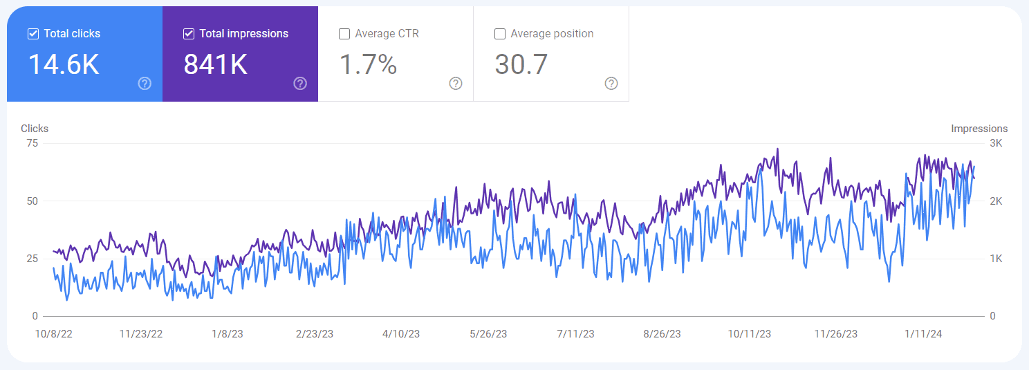
Get found on Google with SEO
Amplify your local impact and let SEO be the powerhouse that drives a steady stream of new leads, ensuring your real estate business thrives.
Expand your database and team confidently, as our SEO strategies position you front and center on Google, precisely where eager buyers and sellers are searching for a realtor like you.
Invest in visibility that counts; let’s chat about harnessing the power of SEO to grow your real estate presence in your target city.
Are you eager to expand your reach?
See how Agent Awesome’s SEO approach can amplify your local presence and keep those leads coming.
Rave reviews from top agents
Top real estate agents declare Agent Awesome, the Canadian marketing agency they can’t do without.
Say hello to the team turning your clicks into clients
At Agent Awesome, we’re a collective of marketing mavericks, digital dynamos, and real estate enthusiasts, all united with one mission: to make you the talk of the town.
We’ve been at it since 2013, ensuring that we’re as seasoned as a Canadian winter when it comes to marketing mastery.
Our team is dedicated to staying ahead of the curve, employing the latest trends and techniques to keep your marketing efforts as indispensable as a remote car starter on a -20C day.

Book a virtual coffee for awesome results
Ready to see what awesome things we can do for your business?
Let’s brew some fresh strategies over a virtual coffee and map out how Agent Awesome can create your next lead avalanche.