There are metrics that marketers can simply never perfect. When it comes to Call To Actions (CTA for short), trying to optimize your conversion rates can seem never-ending.
To make things worse… DSIM reported that 70% of businesses don’t even have a Call To Action on their website! Businesses everywhere need to hop on the conversion optimization train, and improve their Call To Actions or get left in the past.
There are tons of guides on how to test your CTAs with different techniques such as the A/B testing method. This is probably the most common technique and involves testing two different elements of your web design against each other to see what gets the best stats.
But how do these marketers get such high returns? We’re going to talk about some of the different Call To Action stats, and try to provide the information you need to improve your game.
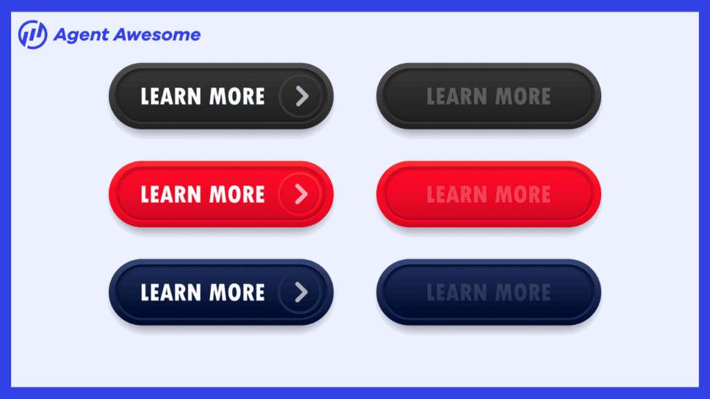
Generic & Descriptive Call To Actions
Generic Call To Actions
Generic Call To Action buttons can be found all over the web. Simple newsletter signup forms and “submit” buttons fall under this category.
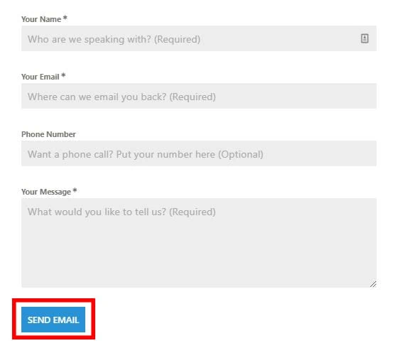
Our contact form on the Agent Awesome contact page has several form fields with messages that talk to the visitor directly, and help guide them through the process.
We wanted to make it super simple for the user to get through the form, so we used a “send email” button at the end to close the deal with our potential customer.
Descriptive Call To Actions
Descriptive Call To Actions hold more power, but can still turn visitors away if they are too over-the-top. You want a nice balance between being personable and professional.
Avoid using “your” and replace it with “my” to dig even deeper into your visitor’s psyche. A good example of this is Crazy Egg’s awesome homepage.
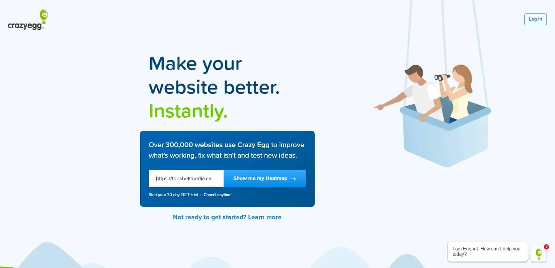
Crazy Egg has a wicked value statement that gets right to the point and is highly personable. They quickly establish that their product will make your website better “instantly”, and the “Show me my Heatmap” button entices visitors to use the Crazy Egg software.
If they still need more information, there is a handy link below that takes them right where they need to be.
On Target
Reaching a web page that leaves you confused is terribly frustrating! Landing pages should have a distinct targeted message that is catered to the user in an easy fashion.
One way to do this is by – you guessed it – Call To Actions.
CTAs with a strong, personalized message can increase your conversion rates by over 202%.
One way to illustrate this kind of message is through geolocation tags. These tags pinpoint a users country, state, or city and customizes the message using this information.
This can be helpful if you are trying to offer regional discounts or segment your audience by location.
The graph below (by HubSpot) shows the importance of having dynamically smart CTAs. Both default and multivariate CTAs had just over 1% in conversion rates, with the smart CTAs sitting at almost 3.5%.

It’s time to put a little bit of personality into your CTAs!
3-2-1 Action!
One of the main reasons CTAs fail to convert is because they aren’t action oriented. This may seem obvious… but your CTAs should entice the user to actually want to make that action.
After all, 90% of visitors that read your headline copy will also read your CTA copy.
Make your message clear enough so that a potential consumer will want to go all the way. Your copy must inspire the individual, and make them feel comfortable enough to take the next steps in the sales process.
Imagine this – you just started your first PPC campaign for your fitness website. The site focuses on workout clothing and equipment for gym members.
You have just launched a brand new line of clothing, and need to get the word out.
After your initial launch you notice that you are getting lots of traffic… but no one’s buying!
Users are leaving your site once they reach it, and aren’t going deeper to where the money is.
You begin to ask yourself… What did I do wrong? Are my ads not working?
Fear not, your ads are not the problem. These problems most likely stem from a Call To Action that is under-performing and isn’t optimized.
Your copy has a huge effect on how visitors perceive your buttons and other Call To Actions.
Instead of a “Shop Now” button, try using language that resonates with the user.
Some CTAs you could use are “Find My Style”, or “My Workout Essentials”. I would personally try these statements and see what my visitors liked the most.
Here’s a great example from Roman Fitness Systems that has a powerful statement followed by a very personable message that sparks action within the user.

They quickly make it clear that they are here for two things: to improve people’s looks, and get people shredded. A prime example of a powerful message that resonates within the user.
Call To Anchor
Some of the most influential CTAs available to bloggers is anchor text. Anchor text refers to the highlighted text found within a link.
HubSpot found that anchor text was responsible for a 121% jump in conversion rates, and that 47% to 93% of a post’s leads came from ONLY anchor text CTAs!
The numbers get even BIGGER with 83% to 93% of post’s leads coming from anchor text and CTAs that internally link.
Huge results if you ask me.
So take the time to make sure you are interlinking within your blogs and using rich anchor text to help get users to other parts of your website.
You can also use anchor text to beef up your affiliate links within your blogs as well!
Definitely a cool trick to keep in mind!
Location, Location, Location!
Where you put your CTAs matters greatly. Grow & Convert made estimates for the conversion rates of different ads based on their location within the page, and the findings are extremely helpful.
Call To ActionLocation CTR Estimates:
- Sidebar: 0.5 – 1.5%
- Generic, end-of-post: 0.5 – 1.5%
- Pop-ups: 1 – 8%
- Sliders and bars: 1 – 5%
- Welcome gates: 10 – 25%
- Feature Box: 3 – 9%
- Navbar: varies
Keep these stats in mind when you are thinking about your CTA placements. Put some extra time in creating and testing some thrilling welcome gate pages, pop-ups, and sidebar Call To Actions.
A/B test till you find the best way to turn a visitor into a customer.
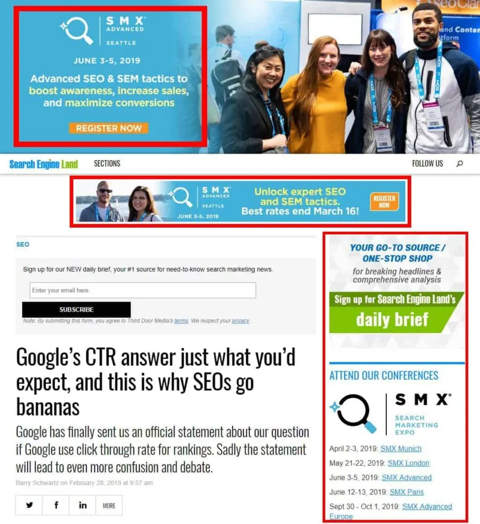
The areas outlined in red show Search Engine Land’s placement of their Call To Actions that see quite a bit of traffic (considering SMX is one of the biggest conferences out there for marketers).
What I like the most about these ads is the content shown within them. On the surface, they are all the same ad for the same product, but they feature different information about the conference in each one.
So each ad still serves its own individual purpose… Brilliant!
Distraction Free
The average human has an attention span of about 8 seconds. This means your CTAs should be clear, concise, and to the point as much as possible in order to rope those visitors in.
Distractions are plaguing websites with their overabundance of elements. Sending an onslaught of ads and pop-ups that take away from the main message.
If your Call To Action is surrounded by different site elements such as ads, sidebars, or a floating carousel of tech programs – you have an issue on your hands.
By keeping your website design simple and clean, you can divert all attention to where it matters. Open Mile saw a 232% increase in conversions after removing the clutter around their CTAs.
Leave less important information below the fold or in a non-intrusive space so visitors can properly assert their attention.

The University of Advanced Technology’s website is a cluttered mess that requires the user to really look for the course they want. It offers little to the user experience, and is difficult to navigate.
The website would be better off with some simple buttons that personalize the experience, and take the visitor to the course they want.
Conclusion
In this week’s blog post we talked about how to improve your Call To Actions so that you get more conversions, and raise sales across your website.
Generic Call To Actions can get the job done, but it is always better to create personalized CTAs that speak to the user and really rope them in. Create some Smart CTAs that really leave an impact on your visitors.
It’s important to remember the location of your CTAs, and that they are free of any potential distractions. Clear the area of any unwanted clutter, and keep your design clean.
If you have questions about the topics we covered, leave a comment down below or shoot us an email – we’d be happy to help!